One of my hobbies is drawing and I love COPIC markers for coloring.
Being highly professional drawing utensils and therefore not the cheapest option, I spend a lot of time selecting which color I’m going to buy next.
The problem that I’ve encountered is a lack of color wheels that make the selection easy.
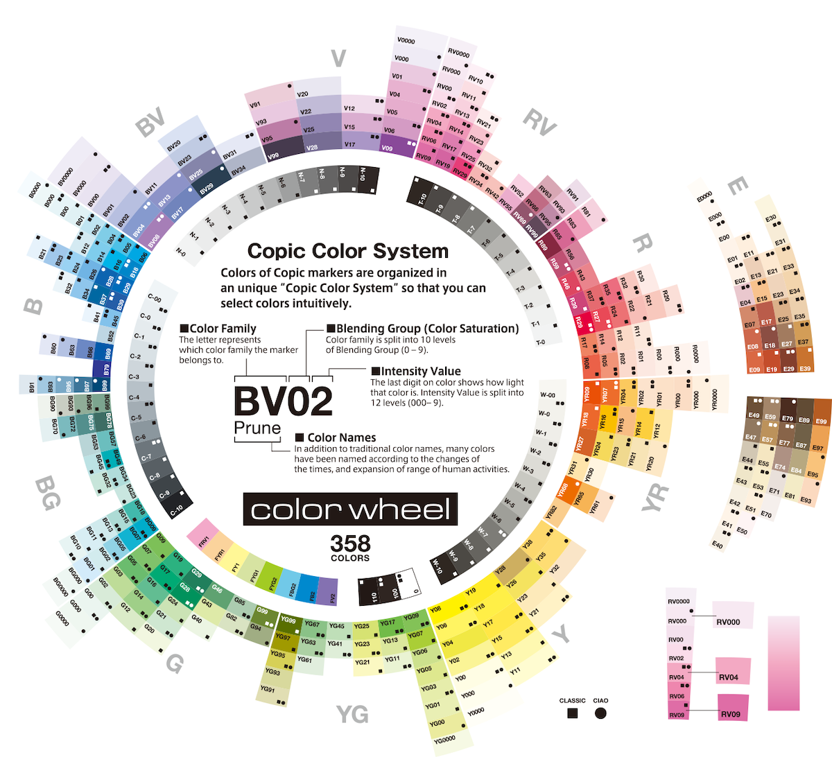
Below you can see one of the official color wheels as provided by the Too Corporation Americas.
 © 2020 Too Corporation Americas. All Rights Reserved.
“Now what’s the problem with this?", you might ask. “Two main problems.", I’d reply.
- The colors deviate from the actual appearance on paper (in value and hue).
- Different intensity values are positioned right next to each other.
getting correct color samples
To solve issue 1, I first collected sample images of all 358 colors from the COPIC color archive.
A typical sample image might look like this:

As you can see, the value strongly depends on how much color one adds to the paper. On the left side, only one layer of strokes has been applied, while more strokes on the right side result in a higher pigment density. Therefore, each COPIC color has more than one value.
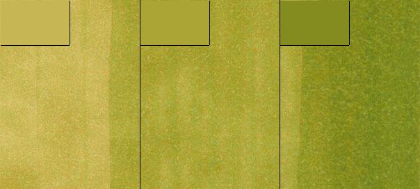
To capture this richness, I sampled three values of each color by averaging over parts of the left, middle, and right regions.
Below are three different colors as derived from each third in the case of YG03 – “Yellow Green”.

A proper COPIC color wheel should therefore contain at least three colors per color code.
comparing different hues of the same intensity
To understand why point 2 is problematic for me, it’s best to describe a real life situation.
I am in love with color BG10 – “Cool Shadow”.
Since I use it excessively, my drawings feel sort of repetitive.
Therefore, I wanted to buy some alternatives with the same soft intensity and stroke variety but a different hue.
The original COPIC color wheels make this selection pretty much impossible because similar values are scattered all over the place.
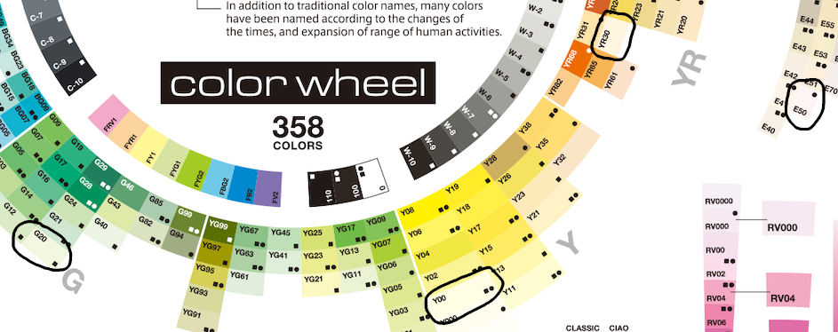
E.g., consider the low-intensity greens and yellows, i.e. G20 vs. Y00 vs. YR30 vs. E50:

Who do they compare? Do I have to buy all of them or are they so similar that one is enough? Sure, if you happen to be in a shop, where you can just grab and compare them, there’s no need for better sorting. But have you heard of COVID-19? Therefore, I decided to write a small script that fetches the color samples from COPIC and creates color wheels to streamline my selection process. Moreover, another script allows me to compare colors which I consider buying side by side.
copic.py
You can find all necessary scripts in this GitHub repository.
A .json-file containing all COPIC colors with with three different stroke densities each is also available there.
Below are some color wheels for twelve COPIC intensity values.


